Belgium that looks good! What did you use make it?
Thanks!
Oh, and I used Blender. Easy, Free to use, and laggy like hell. I love it!
2 Likes
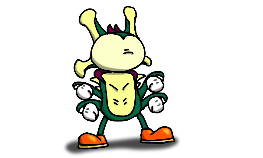
Hopefully this isn’t too bad of a necro, but here is a rendition of The Disturbance ™ done in the style of those old Mickey mouse cartoons (aka rubberhose animation). Enjoy!
4 Likes
Looks more like a wonky Sonic OC, but it looks good!
Disturbance the Edgehog
3 Likes
2 posts were merged into an existing topic: THE NEW Miscellaneous Talk That Doesn’t Deserve A New Thread Thread Thread
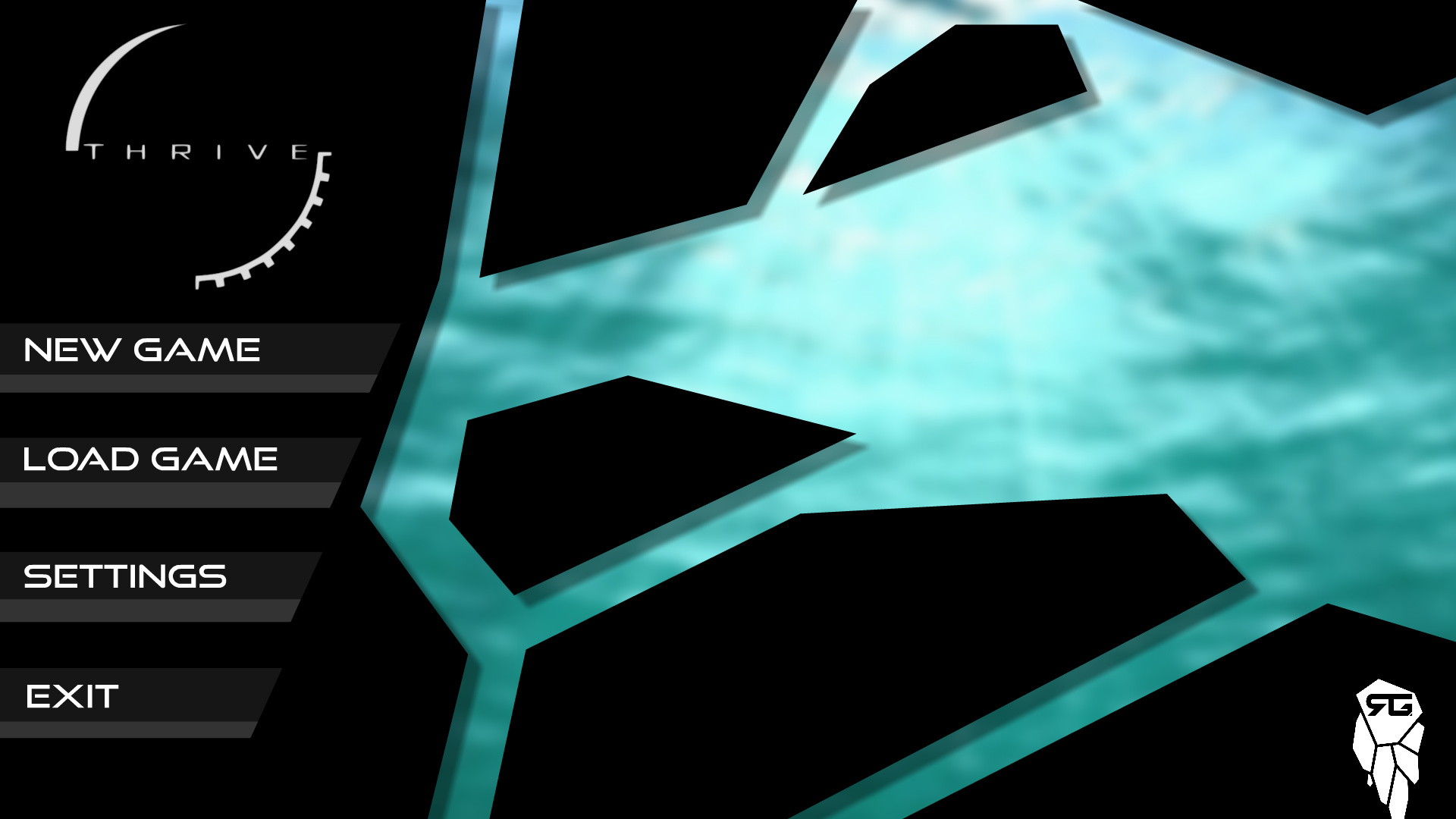
Hello, everyone! I just had an idea for a nice main menu, so I decided to just make a quick concept art of my idea and share it with you. The white spaces wouldn’t be white, but rather a blurry background of a greenish nature, blueish cave or whatever. The Thriv logo is there just as a placeholder, maybe a better solution would be another, huge “white” window. It wouldn’t be white, but a background again (maybe there might be a few of them and it would be randomized). Also, I imagine the background to be moving very slowly.
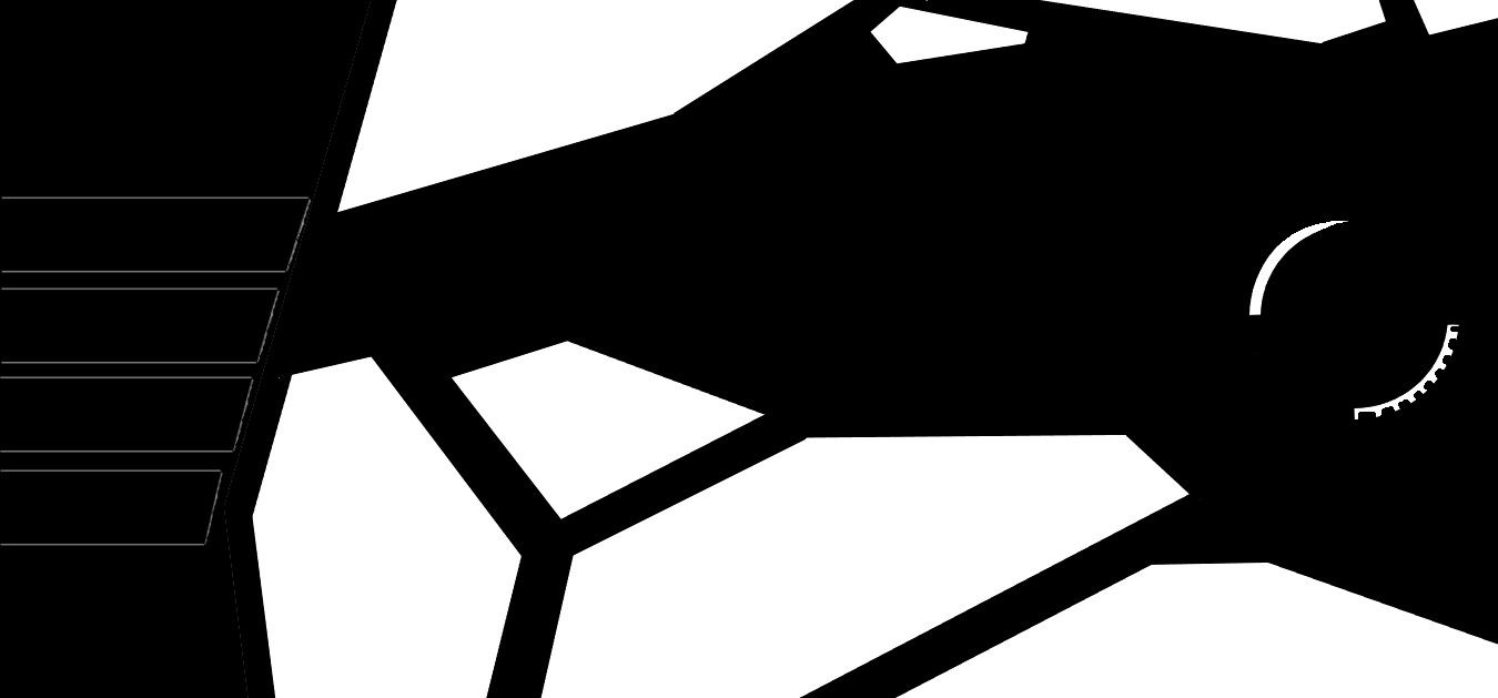
It’s 3:30am here so excuse the “quality”. Tell me what you think!
4 Likes
This is really good! It fits the theme of the game very well. Do you mind if I make a remaster of this menu? It will have all the details in your description
Go ahead! This was made just to get the point across for someone more capable than me. So I am very flattered that you will actually use it. To put it in the actual game? Maybe? To squeeze it into the 0.4.2 deadline? Just asking? I’m kidding lol. And try it with the bigger window instead of the Thriv logo, might look better. This is a random stock image as to visualize how I imagine the background. But maybe a bit more saturated colors? Dunno. The background is also completely up to you. Thank you one more time!
1 Like
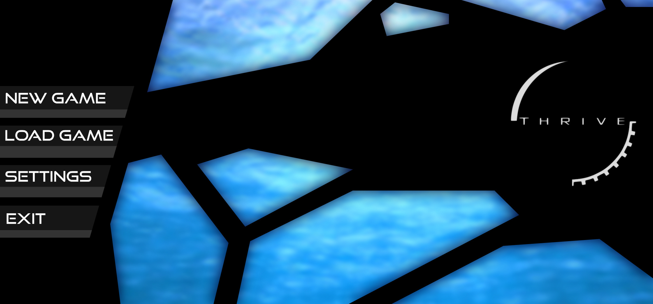
Perhaps the menu could change based on the stage your currently loaded save file is in, so once it is in the water based stages, it would show water, for later stages it would show woodlands, city areas, stuff like that. Space and Ascension could just be outer space or the view of an orbiting planet.
2 Likes
I love you, Mister Crabbo. This is wonderful. And I agree with @BowlDawg, that the background should change either based on the stage, or randomly (for now, as we don’t really have a plenty of stages). Do you think this will make it into 0.4.2? I would be extremely flattered. 
Why thank you! As for including it in 0.4.2, It depends on when it will be released. If soon, probably not. If later on, perhaps. The menu you’ve proposed is very nice, I’m actually working on a v2 that I’ll share with the other devs (and I’ll credit you, of course)
1 Like
Thank you once again! And would you mind sharing the v2 with us as well, once it’s done? I’m very curious, because even the v1 looks amazing!
1 Like
I myself like the current style of menu better than just a few fragments of some art. I still remember the first time I played Thrive and the main menu popping up with the fancy space art that filled the background.
1 Like
Here it is, I’ve decided to add some more detail, but also invert the space, so that the art is easier to see.
6 Likes
I love the details! Also, the color of the background fits even more in my opinion. But I’m really torn regarding the inversion. Part of me loves it, as it’s more open and wide, letting the color in, but part of me likes the background to be “windowed” and divided into smaller pieces. What have you done?! We cannot have both! 
Personally, I liked the first version better, but you are of course free to design it as you wish.
Also, have you gotten any feedback from the dev forum?
Real nice work everyone has made here!
1 Like