i think its time for the next round mr crabbo
2 Likes
ROUND #3
Theme: Ocean
Who’s ready to make a splash? This next round will be focusing on the ocean, whether it be pacific, atlantic, antarctic, I don’t even care! As long as its in a sea of any sort, its all gucchi. It can be a fictional alien creature grazing the sea meadows of titan, or a tropical fish going about its day; its up to you! Good luck artists!
5 Likes
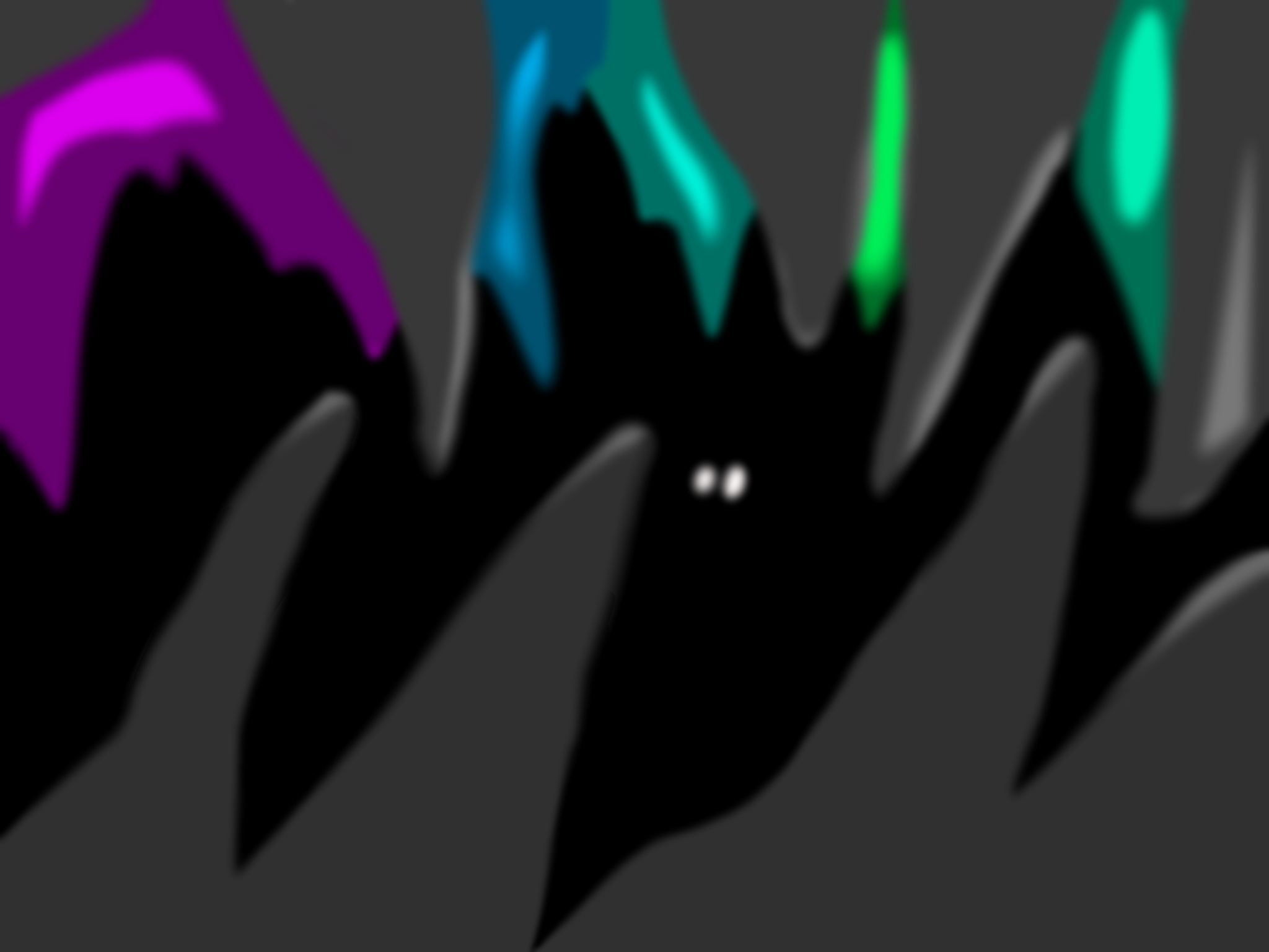
It had to be done. As soon as you announced the theme, the idea came into my head.
A Familiar Sight:

3 Likes
somehow i knew it was gonna be the ocean

also i know that my shading sucks
5 Likes
Well, seeing that picture convinced me that I can’t win this competition.
1 Like
That’s literally the image i was making but in pixel art
yeah if i join i’ll lose
3 Likes
Aaaaaand times up folks! Thanks for participating in round 3!
Vote below for who should win the golden crab award!
- MechanicalPumpkin
- OmnipotentFNarr
- TeaKing
0 voters
(Remember, try to avoid voting for yourself!)
5 Likes
Congratulations @TeaKing
2 Likes
Congrats, @TeaKing!
Can’t wait to see the feedback on this
1 Like
The results for Round 3 are in!
Hurrah! Let us see what became of our contestants!
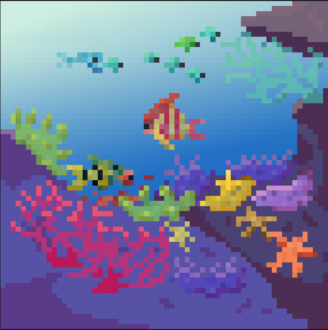
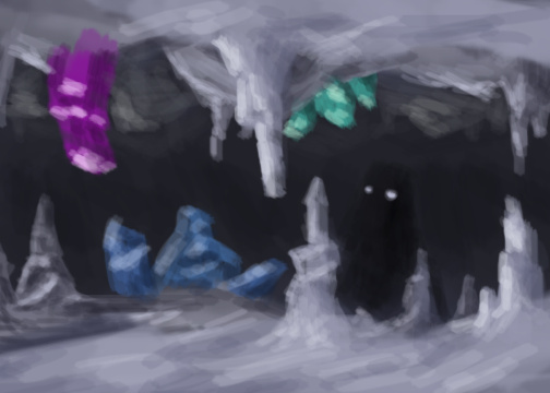
In 1st place, we have @TeaKing with “reef”
Feedback
Good job! The use of gradient is very effective here, giving the scene a clear directional light that also fits with the rock’s shading. Also, I see that parts of the scenery is slightly darker in color, giving it depth. If you could ramp this up a little, it’ll give it a more 3d appearance. Plus, it wouldn’t hurt to add some dark shading to the plant/coral elements; it will help them really ‘pop’ against the background. Aside from that, this is a great piece of art!
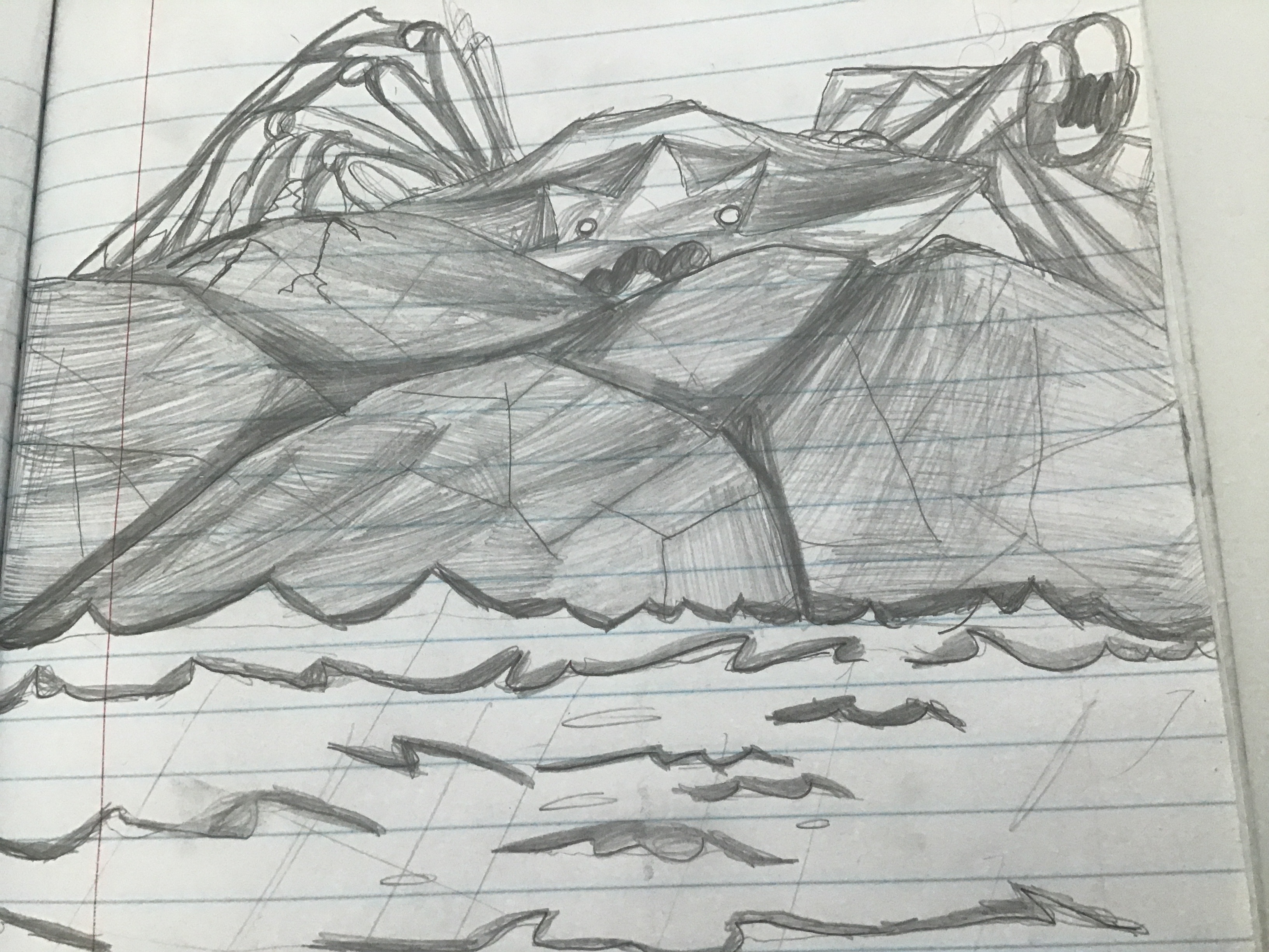
In 2nd place, we have @MechanicalPumpkin
Feedback
Nice work, It has a nice sense of scale! You really get a feeling for how incredibly large this creature is. That being said, I see a few potential changes that could be made. The creature seems to be too similar to the surrounding rocks (assuming those are large rocks and not the crab’s appendages), so either giving it a harsher outline or different shading technique, it’s shape would be a little clearer. Good work with this one, it’s visually interesting.
In 3rd place, we have @OmnipotentFNarr with “A Familiar Sight”
Feedback
I could see where you were going with this one; the shapes are good and the focus is very clear. However, the colors used could be confusing for the audience. The fire doesn’t seem to illuminate any part of the plant, and purple is an odd choice. In fact, I’m not sure about the fire in general. As far as I know, there is no fire that can exist without oxygen, rendering the image visually confusing. The viewers will find the setting slightly ambiguous due to this addition, so rethinking the image’s composition will make for a better artwork. Good effort though, I look forward to your next entry!
Thanks to all of our contestants, and good job on your artworks! Can’t wait to see everyone for round 4! Until next time!
3 Likes
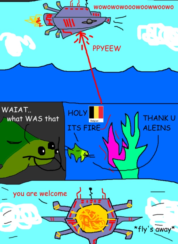
Ah, I see. I knew it was a reference to the underwater civ debate, but wasn’t sure if it was specifically from something. The source material is limiting so I can understand the resulting artwork having a few problems; It was still drawn well, it just needed a bit more to really sell it.
2 Likes
So the people on discord have suggested a new art competition where the results are posted to our social media and youtube. I think it’d be a good choice to combine that with this thread, instead of running two separate competitions.
So I suggest the following:
- This thread moves to a monthly format
- All posts from this thread get posted to discord
- Submissions from discord will be posted / linked to in this thread by someone running the discord side of things (there are a few volunteers for that)
- The drawing prompt will still be posted here
- Voting happens here (people using only discord will need to register here to vote) because the polls are much better than just spamming discord reactions
- After choosing winners the top entry will be posted by some team member on our twitter, and a compilation video will be made by the people over on discord of the submitted art. This video will be posted on our youtube channel (by me if no one else volunteers).
I think that’s about it how this can be ran with minimal effort so that this keeps going.
7 Likes
Starting this contest off in early august, here are the five monthly adjectives to choose from:
- Isolation
- Opposite
- Warning
- Family
- Bait
0 voters
When there are a comfortable amount of voters, the poll will be closed. Then, the winning prompt will be released on the discord, and initiated both there, and on here.
(Edit: The votes have been closed, and it looks like on both community sites, isolation wins! Paint something that captures the meaning of isolation and respects common sense and moral.)
8 Likes
Just in case you missed it, the theme is isolation. And it’s now time to start posting your entries.
I assume that voting on entries will start somewhere around 28th.
6 Likes
BEHOLD:
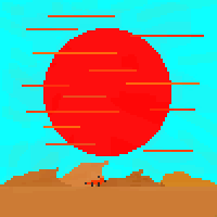
“The Fox”
It is bad, but i couldnt make any of my other ideas half decently.
5 Likes
What do you mean? It looks great! But the bars along the sun makes it look like it’s teleporting.
3 Likes
Definitely not a submission, but I decided to fix up the lighting, composition, and pose to your art work (for practice):
If you feel like it looks good, feel free to use it as a reference!
5 Likes