Hi im jelly, im an older user of this form and havent been active for a while (besides in games).
I decided to make this thread for people who want to improve their art through critique! as I think one of the best ways to improve is to find out what your bad habits and weak points are.
If your looking for empty praise and want to stay stagnate then gtfo this is for people who want their art to be torn to shreds then spit on!!! yess daddy!!!
Ahem sorry about that, anyways the point is if your bad with taking criticism then you should avoid this thread.
I’ll try to critique every post I see but I highly encourage everyone to join in.
there are some rules , despite what I said before unless the artist says otherwise try to use positive critiques only dont just say “boo you suck di-” tell them what you think they could improve on or what they should change.
this thread is for all skill levels but is aimed at beginners and intermediate, remember to take everything with a grain of salt as everyone has their own opinion but learning to take criticism is critical for an artist so make sure to take note of what everyone says.
Have fun everyone, while im not the best artist here ill try to help the best i can 
Hi Mechanical,
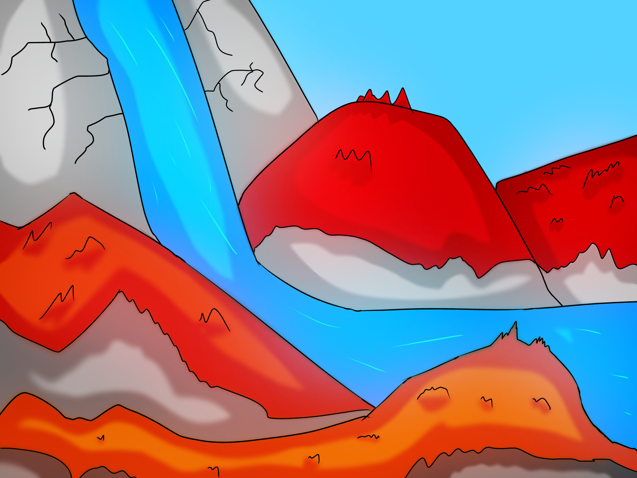
landscapes are actually my weak point but i can still give you some pointers.
Color
1: your colors are too saturated, colors in irl or even illustrations are usually a lot duller then they look and a lot of times they aren’t even the color we think they are.
2: your only using one color and its shade, each color block should have other minor colors mixed in to break it up.
I recommend finding a good illustration that you can use to reference colors with by eye dropping them. take note how the hue and saturations shift and how what you see isnt always the actual color.
Composition
like i said im not the best at landscapes so i cant say much on the this part, but you should add more depth to the piece by lowering the red rocks and adding another layer and fade it out.
Another thing is everything feels too separate and jagged try to flow one thing into the other.
like before I recommend finding a good reference or even multiple to find a good composition (can be the same or different from the color ref)
Final Thoughts
some minor things are you should focus on smoothing out your lines and making them less noticeable a lot of them are sharp and thick lines they should be smooth and have a flow to them if you use them at all.
You should focus on color theory and your technical skill by doing some studies of landscape illustrations.
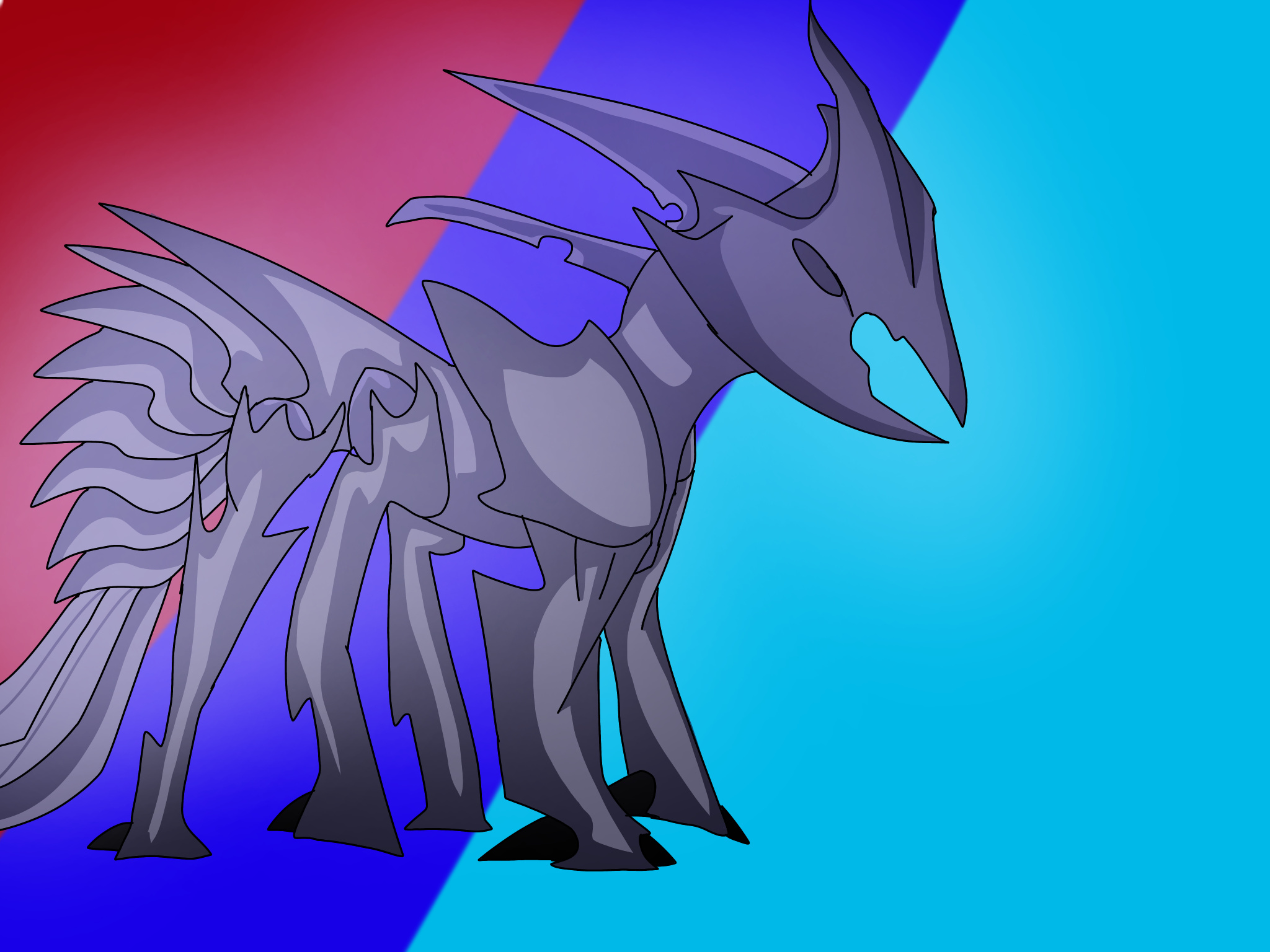
Thank you for the criticism!
Landscapes aren’t exactly my strength too
How is this?
Hey, @MechanicalPumpkin what did you use to draw that? it looks slightly different than what you normally draw.
I just used Ibis Paint X
It looks different because I used the airbrush pen there so I could so some lighting
As a bit of criticism for your art I think it the brown part of the thing could use some texture
That’s the best I could come with, I’m not used to critiquing art
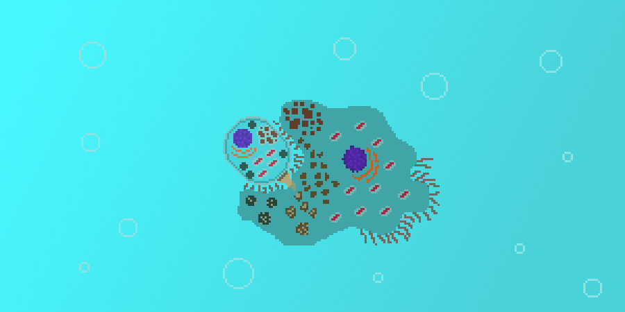
Very nice, but I suggest making the bubbles more noticeable and adding some cells in the background
problem with making the bubbles more noticeable is the fact that with a gradient, it takes forever to fill them in.
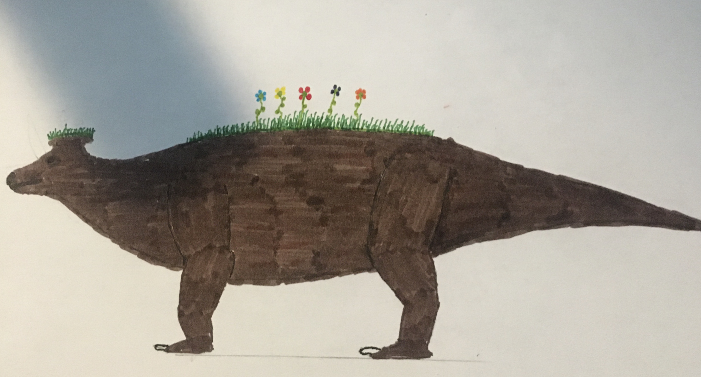
Hi there Mr.Oofer, welcome to my torture chamber thread.
I have two subjects for you about marker techniques and anatomy.
Anatomy
Mainly it seems like you fell for the Mr. PotatoHead trap of just sticking on limbs, this is common with beginners. Like always I recommend using an anatomy reference as limbs always have muscle attachments, like shoulder blades that create a bulge and fade into the body. As for the legs always remember that they are the ass end of the animal literally, so they always tapper out into either a roundish or triangle-ish shape (look up any four legged animal and youll see)
Marker
1: for markers it extremely important you have the right paper and markers, I recommend XL’s Mix media for the sketchbook its better then actual marker paper for some reason. As for markers I use studio 71’s 100 pack their cheap and you can buy them in packs or one at a time.
2: coloring with markers is like welding you make small circles and carry the bead where you want it. In this case the bead is the wetness of the paper, if you go to fast you wont get a even coat but too slow and it’ll dry leaving a boarder. There are numerous amount of great videos on this.
Final thoughts
Id also put more grass on it, maybe make it come down further on the body and add the other pair of legs even if you just put them slightly in front of the current pair.
If you employ what I said here then you’re art should improve a decent amount.
make sure to post here again id love to see how you improve!
heavy breathing
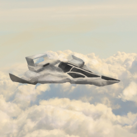
My clouds look like cloud, but my metal looks like it didn’t smeltal
Help?
HI Void and welcome!
your clouds look really good but your plane looks like a crumpled up tinfoil plane.
im not the best with mechanicals as I mainly do organics but ill try my best!
Plane Geometry
the first thing i noticed is how janky the silhouette is, mainly on the bottom. I see what you were trying to do if I focus on it i see whats happening but its hard to tell whats the side and whats the bottom. I think its because the perspective of the nose cockpit is too far out, actually it seems a lot of the perspective is wrong making the plane feel bent and warped. I recommend focusing on perspective more as its important when making inorganics.
Metal Texter
Like I said before I dont draw inorganics much, but I can still give you some pointers about how metal works.
As we all know metal is a reflective material, but what does that mean? It means it reflects the light of other objects like the sky and ground (clouds in this case) in other words, theres a lot of bounce light so there should be little shadow if any there should also be highlight streaks on it as its close to the sun.

So all in all its a good piece, so just work on these little things that are holding you back.
Mechanical, The overall design is nice but I can tell you have absolutely no idea how to shade…
this is a common problem that beginners have.
first you always want to know where your source light is, usually its in a top corner. so there shouldnt be a shadow on the top unless theres a cast shadow from something above it and no light from the bottom (we’ll ignore bounce light for now). You have to think of everything in a 3d plain like if i was to shine a light on this from this direction what would it look like?
another thing is the stronger the light the stronger and harsher the shadow.
good luck, if you end up redoing the shading on this (like you should) then repost it here id love to see it.
i want my art to be destroyed, so i bring an art (with no shades because dumb!)
yes i’ve posted this before but it’s the latest art i’ve made (that i have access to)
what program do you guys use and do you use a mouse, tablet or monitor?
I use paper/ or pixilart, but i have a tablet.
what type of markers/ paper
I use some random watercolor markers from Artists Loft and printer paper.