After playing the game, I find that thrive in it’s current form is the most realistic-feeling representation of life as a single celled organism in gaming. However, in light of the fact that the cell stage is still subject to change, and thanks to the window into the microscopic world that the ‘journey to the microcosmos’ youtube channel provides us, i propose incorporating as many visual details from that channel’s appearance as possible.
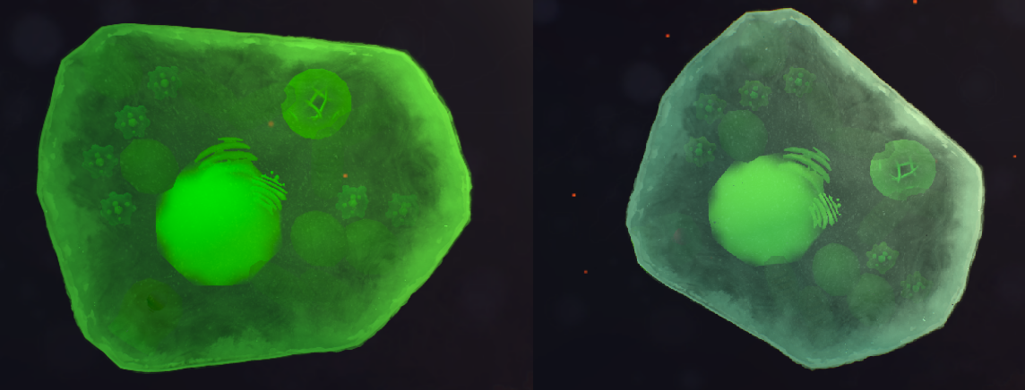
To begin with, the microbes displayed in the ‘journey to the microcosmos’ usually have a shadowy outline which separates them from the background, producing a stark contrast:
On one side of the organism there is a bright outline separating the shadowy area form the organism, and on the other side the organism only possesses the dark shadow. A, reversed, lesser form of this shading exists inside of the creature where light penetrates, usually within the transparent areas of the organism and surrounding firmer objects inside of the organism. Whereas on the outside of the organism the shadow fades outwardly, inside of the organism it fades out inwardly, creating a feeling of depth. Adding these effects in the form of a subtle shader should be doable using the programming software that thrive runs on, and would massively improve the realism of the organisms displayed. And even if this shader leads to reduced performance, it could become an option that the player can turn on or off.
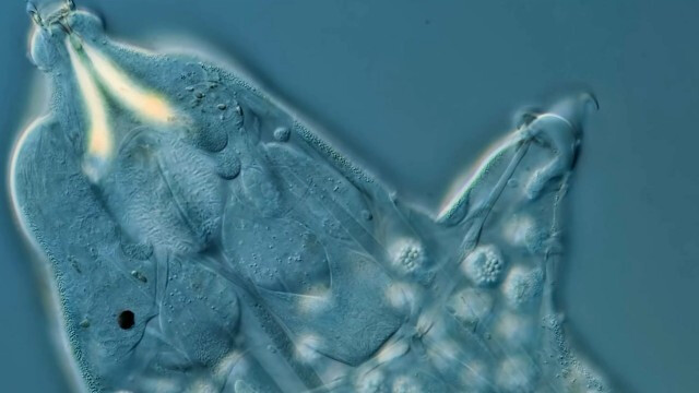
The second detail that’s worth focusing on is the fact that at very small scales, the background environment is a much more uniform blue with differences only in colour gradient and light refraction, rather than being full of background objects such as in the current thrive background:
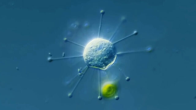
Outside of the organisms that are ‘in frame’ and can interact with the player’s organisms, the background detritus is all a very similar shade of flat colour that produces a sleek, eye-catching contrast between the organisms and their environment. And even when many background details are present, they are very out of focus and blurry:

In my opinion, shifting towards an art style that utilizes areas of low res and blurry detail to emphasize contrast and focus the eyes of the player onto the organisms would make the game more visually appealing, digestible, realistic and pretty. In the areas of barren ocean when on the hunt for resources, your organism would stick out agaisnt the backdrop and look very striking, emphasizing how alone and stranded the player is. And when in a dense mass of teeming life, with lots of action going on around them, the player will feel a greater sense of numbers since each organism will be easier to identify, and their movements more overwhelming and notable.
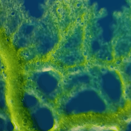
Speaking of blurriness, my third suggestion for improving the art style of the cell stage, is to selectively blur parts of the cell based on it’s location in the 3d space compared to the player camera’s area of focus, such as on flagellum when they wiggle into different locations, sections of the body as it undulates through the water, and parts of the cell as it’s idol animation plays and certain components drift in and out of focus, or rise up and down relative to the cell’s 3d height.
Doing this would probably be the hardest thing to accomplish when programming, but it’d give the artstyle a great deal of authenticity as though we are looking in on the world of our cell via a microscope. It’d also affect other cells based on distance, leading to the environment looking more realistic as blurry cells dart about around you, especially emphasized on the smaller cells. Additionally, the refraction of water as it’s distorted by the passage of cells adn therefore affects how the light hits it could play a big part in this.
Shown with the walk cycle of the tardigrade, the legs that are further in the background and foreground get blurrier than the main body, giving a sense of depth that feels very realistic:
I genuinely think that it’s possible for this game to look nearly identical to real life microbes and the most attractive visuals of them that we can capture on film. Not only would it enhance the believability of the ecosystem during the cell and early multicellular stages, it would also make the game look cleaner and more sleek in how it’s portrayed the the player, and feel nicer to play.
By using including these visual improvements, we can make the game match real life much more closely and fool the player into thinking that they are observing footage of actual microscopic wildlife, and by doing so enhance their gaming experience a lot.