Hello everyone! It’s been a while since I’ve posted an idea I had like this to the forums, so I hope you like it! It’s a smaller idea, but I think it could be a nice little thing to put into Thrive.
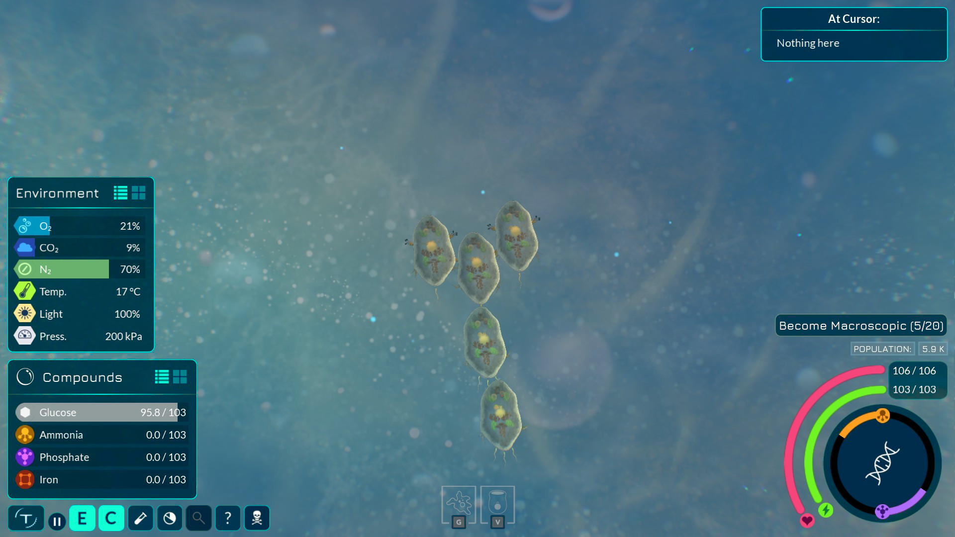
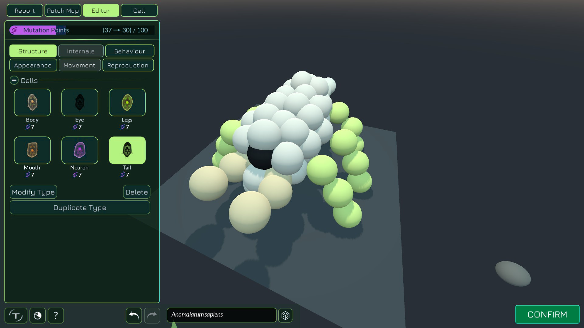
In my opinion, I think Thrive’s UI looks great! It’s minimalist style makes it easy to understand and not feel cluttered, and it fits the environment of the microbial world very well. In later stages, however, it can feel a little jarring compared to the visuals of the game - especially in much different environments, such as land. I think it would be a nice idea to change the UI in later stages to better fit the changing look of the game and give a sense of progression - but making a large-scale change would slightly ruin the slow, gradual process of change between stages, and would make every stage feel more like disconnected games rather than one cohesive whole - even if just a little.
So how could the UI be changed in a way that felt natural with the changing environments of the game, without feeling like a complete overhaul? I came up with a little simple idea which I think could be nice for the game - Stage Themed UI Colors! I think that keeping the UI layout the same while changing it’s colour-scheme for each stage could be a nice change. I made some basic mock-ups of what this might look like below!


Even if this is just a small change, I think it could be a nice little thing to put in Thrive to hopefully improve the game’s feel, even if it’s just a little. Thank you for reading my post!