You guys from the old forum would have probably seen the old version of these, but I have decided to remaster them for a cinematic release! Huzzah!
14 Likes
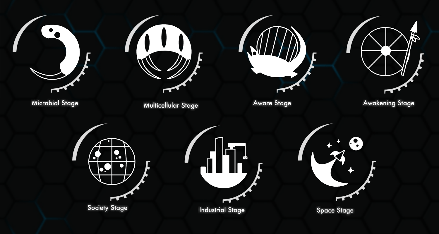
They remind me of Spores icons, only better.
Good work, keep it coming.
1 Like
I prefer the older icons, these ones look a bit goofy (I.E. the rocketship is a bit too broad when compared to the length, and the microbial and multicellular icons are a bit hard to discern what they’re supposed to be) and some like they’re squished into the circle (especially the aware stage)
I do like how you’ve returned to the project, and like what you’ve done to the industrial and awakening icon
(FYI: the thread about the older icons)
1 Like
5 posts were merged into an existing topic: THE NEW Miscellaneous Talk That Doesn’t Deserve A New Thread Thread Thread
I feel like these should eventually be made into more cohesive and simplistic designs. These are a good base, I just think they kind of look clunky.