It’s pretty, certainly, but it is not doing the job a UI exists for: convey information.
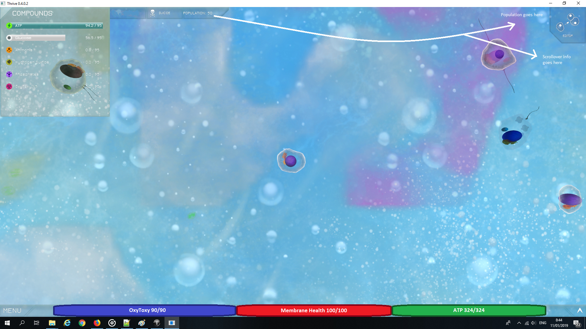
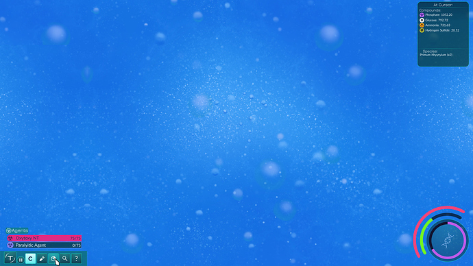
Now, health. It’s important to be aware of what happens to it, correct? Because I literally never notice. I can tell when my cell flickers or when I see myself catch a toxin, but never at any point is my eye drawn to the actual bar.
ATP is just a number, and not a noticeable one. Which isn’t a problem, because there’s an actual ATP bar where all the other stuff is.
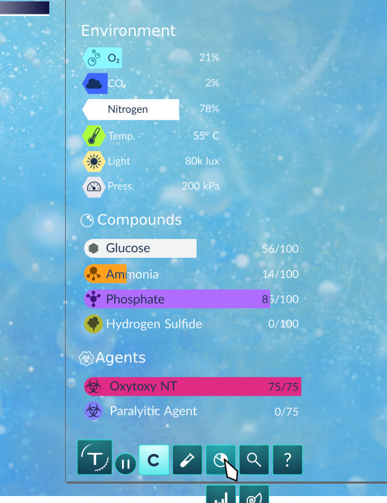
But it shouldn’t be there. Compounds are things you collect. They serve different purposes, are much less important to your immediate survival and therefore should be placed in a different area of the screen. The same goes for OxyToxy. Even flash RPGs don’t place mana or energy bars in the same location as your money.
I feel like being at the bottom of the screen makes them a lot more noticeable. The compound bars have been relegated to the top left (they should not display ATP or OxyToxy any longer, since that distracts from needed information). Population goes next to the reproduction button, since those two things are associated. Finally, there should be some way to make the text more noticeable (maybe the color changes depending on biome?).
To be fair, most of the AAA games I’ve played aren’t much better - Thrive is down there with the sorry likes of Witcher 3 and Stellaris. But you’ve given me a loudspeaker to the dev team and I’m going to use it for all it’s worth.
@That_Dude has designed a lot of GUI concepts. I don’t have any of the images at hand so I hope someone else can post them. And maybe incorporate your feedback into them if they are also lacking in these aspects like the current GUI is.
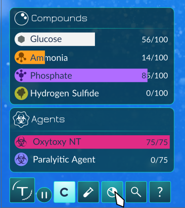
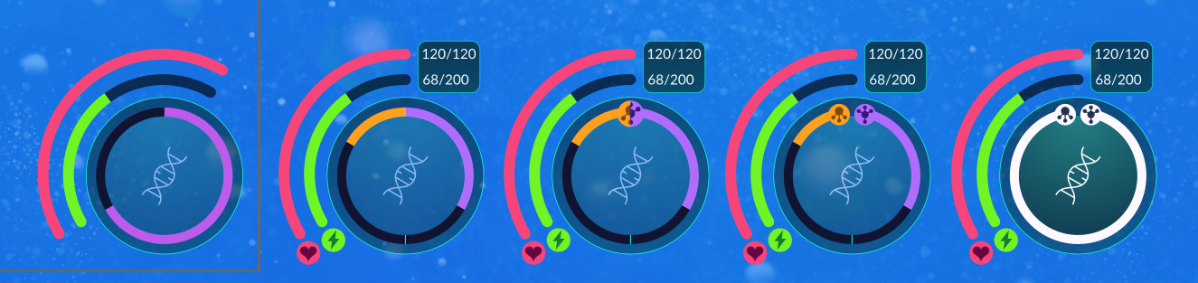
These are Narotiza’s concepts for a new dark GUI, where the bottom right element I believe was created by That Dude. I’ve seen variants where the icon for the resource (Health, ATP, and Reproduction Progress) are displayed, but this is the most recent image.
Of course, there is room for modification, such as a more logical reproduction bar, but it seems to satisfy your desire for a “critical GUI.”
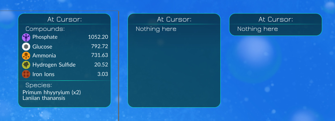
That looks really good, but the lists on the left take up too much screen space I think.
You could remove the empty rows from the lists, make the background more transparent, make it more minimal in general.
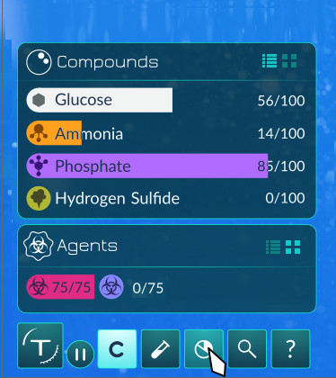
That could look nice. Looking at it again, it could definitely be compressed a bit; I added some extra space to make it more flexible in case new compounds are added by devs or modders, but maybe putting the bars on top of each other like you did is a better way to go.
I’m hesitant about removing the background though just because there’s so many different biome backdrops of different colors that sometimes visibility can suffer…
I definitely want to label the HP and ATP bars, however I have no idea where to put them, there’s not much space where I can put labels without it looking awkward.
I’m sure a tutorial pop-up when you start playing the game that tells you what each bar represents would be fine. If a player is still confused, there could be a Help menu option which helps the player understand the UI and compounds.
Made some variations, all of which including HP/ATP labels and a modified reproduction bar that shows how much ammonia/phosphate you need to collect. The last two are the same design, but one shows both bars being filled and reproduction being complete.
Good idea. 4 and 5 are different stages of the same design though, so I’d condense them into one option.
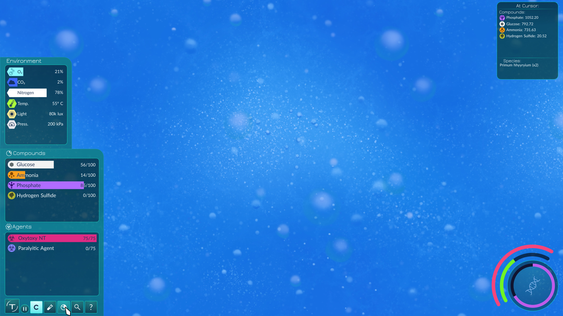
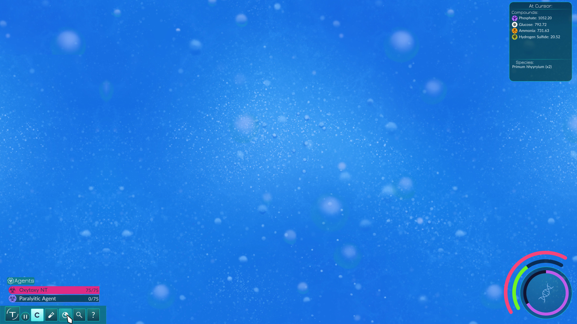
I was a little hesitant about trimming the “At Cursor” box. I added the extra space so that there’d be room for other compounds if a mod added them or something, but if the box can stretch then it can fit any number of entries nicely.
After some thought, I want to ask if HP and ATP numbers are really something necessary to have? Sure, it’s nice to know how much total health and ATP you have, but it also takes a lot of the elegance away from the original design, and most players can probably get by without knowing the exact numbers. That information could probably be viewed in the editor, or some sort of “organism profile.” Curious to hear your thoughts.
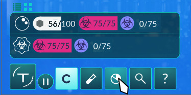
I feel the same for the Ammonia and Phosphate icons; I think they clutter the design a bit too much. Without the icons (which, due to their small size, might be hard to identify anyways) new players might not figure it out as quickly, but they’ll hopefully have plenty of opportunities to figure it out: Through tutorials, help menus, and seeing that, when you collect the orange Ammonia clouds, the orange bar goes up, and when you collect the purple Phosphate clouds, the purple bar goes up.